Contact Center Mobile Design
Zoom · 2024 · Design Leader

Overview
It’s a common scenario in today’s mobile workforce for agents to assist customers while on the move or working remotely. The Zoom Contact Center mobile design aims to extend the full functionality of the desktop experience to mobile devices, enabling agents to respond quickly, manage interactions seamlessly, and maintain high service quality regardless of location. This solution focuses on optimizing layouts for small screens, ensuring intuitive navigation, consistent design language to support productivity anytime, anywhere.
My Role
Platforms
Product
Design Leader
(Sole Designer)
Zoom Contact Center
Mobile Application
Timeline
2024.10 - 2024.12
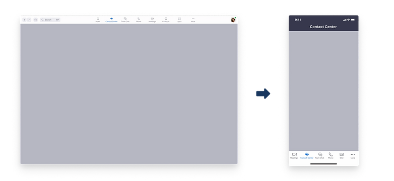
The Design Challenge
Adapting Desktop Power to Mobile Constraints
The functionalities needed on the list are almost identical to those on the desktop. The design challenge lies in how to accommodate the multitude of content present on the desktop while considering the user experience and adhering to the Zoom Mobile design system, all within the constraints of a small mobile screen.
Research & Analysis of Problems and Defining Goals
Understand the user needs
To clarify the necessity for a mobile solution, I used Zoom to conduct user interviews with 10 Contact Center users (agents). The goal was to uncover their work contexts, pain points, and potential scenarios where mobile access would be essential. Below are the key interview questions I asked:
"What are the typical scenarios in which the agent will use Contact Center mobile?"
"Which channels do agents use most frequently on Contact Center mobile?"
Key Takeaways:
-
Agents and supervisors need to switch effortlessly between desktop and mobile, ensuring consistent workflows for both work hours and after-hours tasks.
-
Industries like retail and logistics depend on mobile call handling and status monitoring, especially during late-night operations.
-
Status management must be quick and visible, with a focus on supporting ZCC, SMS, and Chat channels.

Competitive Analysis
To better understand the current mobile capabilities in the contact center market, I reviewed four leading solutions: Talkdesk, Daktela, Mobile Office for Genesys(Voice only), Freshdesk. Most competitors offer mobile voice capabilities, but few deliver a truly seamless, multi-channel, and user-friendly experience. This gap creates an opportunity for Zoom Contact Center mobile to differentiate through cleaner design, smoother cross-platform transitions, and prioritized core features.

Design Process
Ideation
Based on research findings, I brainstormed possible interface layouts and interactions for the mobile call experience, creating low-fidelity wireframes to explore different ways of presenting core call controls. The goal was to translate key desktop functionalities into a compact, intuitive mobile format while preserving usability on a small screen.
These concepts were then validated through user testing, which provided valuable agent feedback. Insights from testing guided refinements to ensure the final interface aligned with real-world workflows and needs.

Wireframes
Before moving into high-fidelity design, I created a set of low-fidelity wireframes to map out the core call experience for Zoom Contact Center Mobile. This stage allowed me to focus entirely on functionality, deciding what needs to be there, without being distracted by visual styling.
Working through wireframes helped me quickly test different arrangements of core call controls, status indicators, and navigation flows. It also clarified how to adapt desktop-level features to a smaller mobile format while maintaining usability.
Questions I asked myself during this process included: Where should each feature be placed for quick access? Which features should share the same screen, and which should be separated? How should users navigate between them? How do successful mobile apps structure features to create a clear hierarchy? This exploration ensured that the final design would be both functional and intuitive.

Align the Zoom Mobile Design System
Before starting the design process, I also consulted with the design owner of the Zoom mobile design system and gained an understanding of our latest Zoom mobile framework. I've also identified relevant resources to use as references, ensuring that our mobile design aligns with Zoom's style and guidelines.

Design Style

High Fidelity Design
After validating the wireframes, I moved into high-fidelity design to bring the Zoom Contact Center mobile experience to life. The focus was on maintaining clarity, usability, and consistency with Zoom’s mobile design system while implementing real-world functionality.
Core Feature 1: Start & End Work Session
-
Scenario: Agents can easily start or end their work session directly from the mobile app.
-
Design Highlight: A clear, accessible interface ensures agents can quickly update their status, helping them manage work hours and transitions smoothly while on the go.


Core Feature 2: Handling Voice Calls
-
Scenario: Agents manage voice calls on mobile, including answering, transferring, pausing, or ending calls.
-
Design Highlight: Core call controls and caller information are presented in a compact, intuitive layout, allowing agents to respond efficiently while maintaining visibility of key details.

Conclusion
It's just an start, much more to do
Designing the Zoom Contact Center mobile experience was all about balancing functionality with simplicity. Agents need powerful tools on the go, but the small screen requires careful prioritization and clarity. By focusing on core workflows, like starting work sessions and handling voice calls—we created a mobile interface that feels intuitive, responsive, and aligned with Zoom’s design language. Ultimately, this design helps agents stay productive anywhere, without feeling overwhelmed or losing access to essential features.